Found
Curated Luxuries & Escapes.

Found is a publication specializing in high-end guides to modern metropolises. Found unveils dining delights, wanderlust escapes, exclusive interviews and indulgent recommendations. My expertise provided a firm design foundation for Found’s launch. This role entailed creating a library of components, developing a visual identity, and building social templates, positioning Found as must read city guide for the chic and elite.
Contributions
↳ Shape product and visual identity
↳ Build systems for product, brand, market and partner expansion
↳ Align product and visual direction with founders
↳ Industry reseach and analysis
Testimonial
“Working with Dair on branding and design was a highlight of the first days of FOUND. He brought all of his ample creativity, diligence, and good humor to the project — and he always overdelivered. We'd work with him again without hesitation.”
– Josh Albertson, Co-founder, FOUND
How Found is doing
0↦100K+
Subscribers
1↦6
Locations
Discovery
Trends and Archetypes
Formula Structure
↳ Consistent sections

Varied Sections
↳ Select fitting sections

Freeform
↳Experts explore topics.

Compressed Formatting Reigns
Brevity rules in newsletters. Compressed formatting has become the norm, overshadowing long paragraphs. This trend reflects a shift towards more structured, reader-friendly formats in the newsletter industry. For further reading on an industry leaders approach check out Smart Brevity from the founders of Axios and Politico.
Define
Experience Essentials

Newsletter Components
Through direct analysis of dozens of newsletters across editorial, lifestyle, and commerce verticals, I identified a repeatable structure used to engage readers and scale content operations. Despite variation in tone and format, most followed a consistent flow
Utilities like date, edition, location, and weather.
Clear branding through company name and title hierarchy. Most intros feature an editorial note or skimmable overview.
Intro
A mix modular snackable units: headlines, lists, product highlights, paragraphs and visual elements like pull quotes, charts, and cards. Partner content is typically separated with a clear label and CTA.
Body
Closes with dense link clusters, recirculation blocks, or calls to action. Formats include “Most Popular” lists, sponsor shoutouts, and social or community invites.
Outro
Develop
Style Sandbox
Patterns set the stage
In the discovery phase, typography, color, and spacing from 20+ newsletters were analyzed, revealing immediate, clear patterns due to the medium's strictness. This data equipped Found with industry-wide newsletter formatting insights, setting the stage for strategic brand positioning.

Header Type
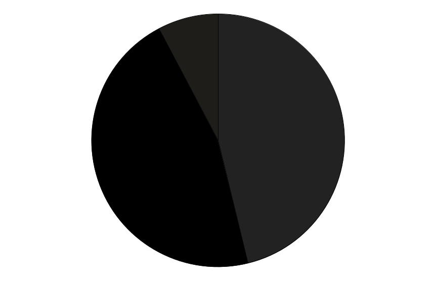
Equal Blend of Black and Dark Gray.
#000000, #222222
Body Type
Mostly Dark Gray followed by Charcoal.
#222222, #333333

Backgrounds
Primarily White and shades of Gray.
#ffffff, #f5f5f5-#f7f7f7

Deliverables
Design System & Color Palette
Guidelines were developed to support organic growth and seamless expansion. The system pairs utility-driven structure with a color palette inspired by pearl pastels and luxury tones—offering flexible options for editorial, identity, and marketing use.
Typography
The logo reinforces a clear, distinct brand voice. It features the Bourgeois typeface, created by Jonathan Barnbrook. Locations are fitted with Helvetica, playfully nodding to the typeface's rich history in way-finding and luxury goods.
Social Templates
The social extension showcases Helvetica's style range as a supporting font, with layout and typography amplifying the publication's editorial vision and art direction.


